

hub portal
Redesign of an internal portal for employees to manage and request access to cloud accounts
objective
Streamline request workflows for all five personas :
Super Admin, Generic Users, Account Admin, Billing Admin and Security admins - enabling faster task completion, clearer decision-making, and reduced operational errors, while minimizing cognitive load and overall user friction. I was the lead researcher and UX designer on this 6 week engagement.
TIMELINE
W1
W2
W3
W4
W5
W6
USER RESEARCH
ARCHITECTURE
JOURNEY MAPS
DESIGN SYSTEM
WIREFRAMING
HIGH FI DESIGNS
DEV SUPPORT
CHALLENGES
-
Tight timelines, 3 resources.
-
Design system not in place ; while their B2C products have a design system in place, the clients wanted something new for their internal product.
-
Client not ready to invest more time in research ; they already had a list of painpoints and wanted us to act only on those.
-
Multiple decision makers ; decision making long and tedious
-
Users in various time zones ; clients refused meetings with clients outside India.
research
Given the limited time available for research, we began by building personas and mapping the existing flows. The product served multiple personas, each interacting with different sets of screens, making it critical to develop a deep understanding of their needs and behaviors before designing. To achieve this, we conducted a collaborative session to define personas, map their journeys, and surface key pain points.

Workshop with SME's and users


Major work flows
Pain points mapping to personas


Personas : Super admin , General user, Account admin, Security admin, Billing admin
Current UI

Super admin Dashboard
Information overload, not task driven
Colour palette undecided
Inconsistent components / icons / patterns
Redundant data
Cloud accounts provides a total count but does not indicate a date range or click back feature
Generic user account view page
Navigation unclear - cloud account tabs not clearly visible
Spacing and layout issues
Menu icon placement confusing
Table behavior is erratic
No breadcrumbs
No filtering option

Generic user request form
Sections not divided intuitively
Redundant fields
Can't switch between steps
Navigation of 'view' and 'account request' is confusing
No drafts feature
Confusing field dependencies and weak validation leading to errors
pain point themes
Process

-
Complex, unclear workflows for account requests and approvals lead to repeated requests and delays.
-
Limited automation for recurring tasks such as patching, compliance checks, and reminders.
-
Duplicated effort across users and admins due to fragmented access and unclear role definitions.
-
No single source of truth for reporting—users must rely on multiple dashboards (CUDOS, Azure, CFD-Custom, etc.).
-
Audit trails are missing or difficult to access, making change tracking and accountability challenging.
Navigation

-
Long, complex forms with no tooltips, inline help, or draft-save capability.
-
Confusing navigation due to unclear labels, poor grouping, and missing breadcrumbs.
-
Lack of guided onboarding, leaving new users unsure how to begin or complete key tasks.
-
Weak feedback cues, with no clear success/error states or progress indicators.
-
Performance issues, including slow load times and inconsistent responsiveness.
Info access

-
No unified view of cloud costs and resource usage, requiring manual tracking across tools.
-
Limited cost transparency, with unclear breakdowns and hidden markups.
-
Fragmented security and compliance insights, not easily accessible from the dashboard.
-
Poorly surfaced notifications and alerts, leading to missed updates or delayed actions.
-
Lack of contextual ownership details, such as account owners or support contacts.
General

-
Outdated, unintuitive interface that lacks a modern, global-grade experience.
-
Inconsistent visual design, with limited color use, unclear icons, and static visuals that reduce engagement.
-
Poor visibility into request status and ownership, causing confusion and frequent follow-ups.
Architecture

After mapping the various flows with the clients—adding some and removing others—we aligned with the client on the number of processes that could be finalized within the given timeline.
This provided us a clear idea on the amount of work, existing flow and pain points of the personas.
IDEATION
Along with SME's, we conducted an ideation session and identified areas of improvement along with possible solutions.
Dashboard
The portal should feature robust dashboards for each persona as the landing page, displaying personalized and meaningful information such as owned or accessible accounts, recent activity, and raised requests. This is a high-impact, feasible enhancement.
Cloud Cost Summary Display
Users should have access to an overall cost summary for their cloud accounts—especially those they own—directly on the dashboard, providing a consistent view of spending on a monthly or six-month basis.
AI bot
The existing chatbot should be enhanced to handle basic, context-specific account queries—such as identifying technical contacts or retrieving relevant email addresses—so users can get quick answers without navigating away from the interface or raising a support request.

Security and News Feeds
The dashboard should aggregate feeds from security tools to present overall compliance levels and risk scores across cloud accounts. In addition, curated feeds from popular technology news sources such as TechCrunch and Reddit can be integrated to provide relevant industry and threat intelligence updates.
iterations
While the iterations and UX improvements were being made to the flow, other designers were working on the design system parallely.


.png)


Low fi mockups
final ui

Super admin dashboard
The customized dashboard surfaces the key information admins need to complete their daily tasks, with dedicated download actions for quick reporting and tab-based views to enable easy comparisons.
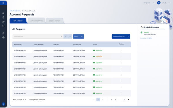
View account requests
All requests are displayed in a scannable table, with tabs to switch seamlessly between AWS, GCA and Azure. Based on insights from co-creation sessions, we introduced a Drafts feature to help users save and resume requests without losing progress.

Create account request
The entire flow was broken down into clear, scannable sections to reduce cognitive load. We introduced contextual help and a visible progress bar to guide users through the process and set clear expectations at each step.


Other screens in the product
success metric
Reduced Time to Complete Requests (previously took approx 4 mins to fill account request)
Fewer incorrect submissions after adding contextual help
Usage of drafts feature
Clicks on downloads
Reduction in support tickets
Reduction in manual follow ups
Reduced wait times in processes